Lab B04: Teams styling and themes
This lab is part of Path B, which begins with a Northwind Orders application that does not use Azure AD authentication.
In this lab you will begin with the application in folder B03-TeamsSSO, make changes as per the steps below to achieve what is in the folder B04-StyleAndThemes.
See project structures comparison in Exercise 1.
- B01-begin-app: Setting up the application with Azure AD
- B02-after-teams-login: Creating a Teams application
- B03-after-teams-sso: Adding Azure AD SSO to your app
- B04-after-apply-styling: Teams styling and themes(📍You are here)
We will cover the following concepts in this exercise:
Features
- Apply teams styling and themes to your existing application.
Project structure
The project structure when you start of this lab and end of this lab is as follows.
Use this depiction for comparison.
On your left is the contents of folder B03-after-teams-sso and on your right is the contents of folder B04-after-apply-styling.
-
🆕 New files/folders
-
🔺Files changed
| Project Structure Before | Project Structure After |
|---|---|
B03-after-teams-sso
    ├── client
    │   ├── components
    │       ├── navigation.js
    │   └── identity
    │       ├── aadLogin.html
    │       └── aadLogin.js
    │       ├── identityClient.js
    │       └── login.html
    │       └── login.js
    │       └── teamsLoginLauncher.html
    │       └── teamsLoginLauncher.js
    │       └── userPanel.js
    ├── modules
    │   └── env.js
    │   └── northwindDataService.js
    │   └── 🔺teamsHelpers.js
    ├── pages
    │   └── categories.html
    │   └── categories.js
    │   └── categoryDetails.html
    │   └── categoryDetails.js
    │   └── myOrders.html
    │   └── orderDetail.html
    │   └── orderDetail.js
    │   └── privacy.html
    │   └── productDetail.html
    │   └── productDetail.js
    │   └── termsofuse.html
    ├── index.html
    ├── index.js
    ├── 🔺northwind.css
    ├── manifest
    │   └── makePackage.js
    │   └── 🔺manifest.template.json
    │   └── northwind32.png
    │   └── northwind192.png
    │   └── constants.js
    │   └── identityService.js
    │   └── northwindDataService.js
    │   └── server.js
    ├── .env_Sample
    ├── .gitignore
    ├── package.json
    ├── README.md
|
B04-after-apply-styling
    ├── client
    │   ├── components
    │       ├── navigation.js
    │   └── identity
    │       ├── aadLogin.html
    │       └── aadLogin.js
    │       ├── identityClient.js
    │       └── login.html
    │       └── login.js
    │       └── teamsLoginLauncher.html
    │       └── teamsLoginLauncher.js
    │       └── userPanel.js
    ├── modules
    │   └── env.js
    │   └── northwindDataService.js
    │   └── 🔺teamsHelpers.js
    ├── pages
    │   └── categories.html
    │   └── categories.js
    │   └── categoryDetails.html
    │   └── categoryDetails.js
    │   └── myOrders.html
    │   └── orderDetail.html
    │   └── orderDetail.js
    │   └── privacy.html
    │   └── productDetail.html
    │   └── productDetail.js
    │   └── termsofuse.html
    ├── index.html
    ├── index.js
    ├── 🔺northwind.css
    ├── 🆕teamstyle.css
    ├── manifest
    │   └── makePackage.js
    │   └── 🔺manifest.template.json
    │   └── northwind32.png
    │   └── northwind192.png
    │   └── constants.js
    │   └── identityService.js
    │   └── northwindDataService.js
    │   └── server.js
    ├── .env_Sample
    ├── .gitignore
    ├── package.json
    ├── README.md
|
Exercise 1: Code changes
Step 1: Add new files & folders
In the project structure, on the right under B03-after-teams-sso, you will see emoji 🆕 near the files & folders.
They are the new files and folders that you need to add into the project structure.
- Create a file
teamstyle.cssinclientfolder and copy below code block into it:
:root {
  /* common */
  --brand-color: #6264A7;
  --button-color: #6264A7;
  --button-text-color: #fff;
  --button-hover-color: rgb(88, 90, 150);
  --button-hover-text-color: #fff;
  --button-active-color: rgb(70, 71, 117);
  --button-active-text-color: #fff;
  --button-border: 1px solid hsla(0,0%,100%,.04);
  --button-shadow: rgb(0 0 0 / 25%) 0px 0.2rem 0.4rem -0.075rem;
  --button2-color: #fff;
  --button2-text-color: rgb(37, 36, 35);
  --button2-hover-color: rgb(237, 235, 233);
  --button2-active-color: rgb(225, 223, 221);
  --button2-border: 1px solid rgb(225, 223, 221);
  --button2-shadow: rgb(0 0 0 / 10%) 0px 0.2rem 0.4rem -0.075rem;
  --button-disabled-color: rgb(237, 235, 233);
  --button-disabled-text-color: rgb(200, 198, 196);
  --input-background-color: rgb(243, 242, 241);
  --input-border-color: transparent;
  --input-border-width: 0 0 0.1429rem 0;
  --input-focus-border-color: transparent;
  --input-focus-border-bottom-color: #6264A7;
  --table-color: transparent;
  --table-border: 1px solid rgb(237, 235, 233);
  --border-color: rgb(237, 235, 233);

  /* light theme */
  --font-color: rgb(37, 36, 35);
  --background-color: #fff;
  --link-color: #6264A7;
  --border-color: #E1DFDD;
  --warning-color: #C4314B;
}

[data-theme="dark"] {
  --font-color: #fff;
  --background-color: transparent;
  --link-color: #A6A7DC;
  --border-color: #605E5C;
  --warning-color: #F9526B;
}

[data-theme="contrast"] {
  --brand-color: #ffff01;
  --font-color: #fff;
  --link-color: #ffff01;
  --background-color: transparent;
  --border-color: #fff;
  --button-color: transparent;
  --button-text-color: #fff;
  --button-hover-color: #ffff01;
  --button-hover-text-color: #000;
  --button-active-color: #1aebff;
  --button-active-text-color: #000;
  --button-border: .2rem solid #fff;
  --input-background-color: transparent;
  --input-border-color: #fff;
  --input-border-width: 1px;
  --input-focus-border-color: #1aebff;
  --input-focus-border-bottom-color: #1aebff;
  --warning-color: #ffff01;
}

body {
  background-color: var(--background-color);
  color: var(--font-color);
  box-sizing: border-box;
  font-size: 14px;
}

a, a:visited {
  color: var(--link-color);
  text-decoration: none;
}

a:hover, a:active {
  text-decoration: underline;
}

table, caption, tbody, tfoot, thead, tr, th, td { /*reset */
  margin: 0;
  padding: 0;
  border: 0;
  font-size: 100%;
  font: inherit;
  vertical-align: middle;
  border-collapse: collapse;
}
table {
  display: table;
  background-color: var(--table-color);
  border-spacing: 0;
}
tr {
  display: table-row;
  border-bottom: var(--table-border);
}
th, td {
  display: table-cell;
  height: 3.4286rem;
  padding: 0 0.5714rem;
}

th{
  font-weight: 600;
}

button, input, optgroup, select, textarea {
  font-family: inherit;
  font-size: 100%;
  line-height: 1.15;
  margin: 0;
}

button {
  min-width: 6rem;
  font-weight: 600;
  height: 2rem;
  padding: 0 1.25rem;
  vertical-align: middle;
  border-radius: 2px;
  background-color: var(--button-color);
  color: var(--button-text-color);
  border: var(--button-border);
  box-shadow: var(--button-shadow);
  overflow: visible;
}
button:hover {
  background-color: var(--button-hover-color);
  color: var(--button-active-text-color);
}
button:active {
  background-color: var(--button-active-color);
  color: var(--button-active-text-color);
  box-shadow: none;
}
button[disabled] {
  background-color: var(--button-disabled-color);
  color: var(--button-disabled-text-color);
  box-shadow: none;
}
button:not(:last-child) {
    margin-right: 0.5rem;
}

button.secondary {
  background: var(--button2-color);
  border: var(--button2-border);
  color: var(--button2-text-color);
  box-shadow: var(--button2-shadow);
}
button.secondary:hover {
  background-color: var(--button2-hover-color);
}
button.secondary:active {
  background-color: var(--button2-active-color);
}

label {
  margin: 0 0.7143rem 0.2857rem 0;
}

input {
  background-color: var(--input-background-color);
  padding: 0.3571rem 0.8571rem;
  line-height: unset;
  border-width: var(--input-border-width);
  border-radius: 0.2143rem 0.2143rem 0.1429rem 0.1429rem;
  border-color: var(--input-border-color);
  outline-style: none;
  overflow: visible;
  margin-bottom: 1.4286rem;
}
input:focus {
  border-color: var(--input-focus-border-color);
  border-bottom-color: var(--input-focus-border-bottom-color);
}

[type=checkbox], [type=radio] {
  padding: 0;
  margin-right: 0.5rem;
}

hr {
  border: 0;
  height: 1px;
  background: var(--border-color);
}

/* Text styling classes */

.medium {
  font-size: 1rem;
}
.small {
  font-size: 0.8571rem;
}
.smaller {
  font-size: 0.7143rem;
}
.large {
  font-size: 1.2857rem;
}
.larger {
  font-size: 1.7143rem;
}
.danger, .warning, .alert, .error {
  color: var(--warning-color);
}


/* Font */

@font-face {
  font-family: 'Segoe UI Web';
  src: url('https://static2.sharepointonline.com/files/fabric/assets/fonts/segoeui-westeuropean/segoeui-regular.woff2') format('woff2'), url('https://static2.sharepointonline.com/files/fabric/assets/fonts/segoeui-westeuropean/segoeui-regular.woff') format('woff');
  font-weight: 400;
  font-style: normal;
}

body {
  -moz-osx-font-smoothing: grayscale;
  -webkit-font-smoothing: antialiased;
  font-family: 'Segoe UI', 'Segoe UI Web', -apple-system, BlinkMacSystemFont, 'Roboto', 'Helvetica Neue', sans-serif;
}
This CSS contains basic stylings for Teams UI. After applying the styles, the existing web app gets more consistent look-and-feel to Teams client.
The CSS also includes dark and high-contrast mode. The color switch is done with CSS variables. In the next step, you will enable the theme switching functionality in JavaScript.
Step 2: Update existing files
In the project structure, on the right under B04-StyleAndThemes, you will see emoji 🔺 near the files.
They are the files that were updated to add the new features.
Let’s take files one by one to understand what changes you need to make for this exercise.
1. modules\teamsHelpers.js
- Import the Teams JavaScript SDK, which creates a global object
microsoftTeamsthat we can use to access the SDK. You could also load it using a<script>tag or, if you bundle your client-side JavaScript, using the @microsoft/teams-js npm package. Copy below import statement to the top of the file:
import 'https://statics.teams.cdn.office.net/sdk/v1.11.0/js/MicrosoftTeams.min.js';
-
The Teams client supports three themes—light mode, dark mode, and high contrast mode (which is an accessibility feature for users with low visual acuity). As the users switch the themes, your application should also switch its theme so as to blend in. To detect theme switching in Teams client we’ll have to use the global
microsoftTeams’s context. -
We ‘ll add a function
setTheme()to switch the css between the application’s native style and the team’s themes. Copy and paste below code block: ```javascript function setTheme (theme) { const el = document.documentElement; el.setAttribute(‘data-theme’, theme); // switching CSS };
> Every time the theme is detected/changed (which we will discuss in the next bullet point), the script applies a data-theme value in the root of the content, like, <html data-theme='dark'>, so the `teamstyle.css` can use a correct set of colors & styles for each theme. The color change is done with the CSS variables.

- Initialize the teams SDK and detect current context with `getContext()` and set the theme.
  When there is a theme change, update the CSS by registering an event handler for theme changes with `registerOnThemeChangeHandler()`.
Copy and paste below code block for this purpose:
```javascript
microsoftTeams.initialize(() => {
    // Set the CSS to reflect the current Teams theme
    microsoftTeams.getContext((context) => {
        setTheme(context.theme);
    });
    // When the theme changes, update the CSS again
    microsoftTeams.registerOnThemeChangeHandler((theme) => {
        setTheme(theme);
    });
});
2. client\northwind.css
- Import the
teamstyle.cssso it is loaded in all pages. Copy below import statement to the top of the file:@import "teamstyle.css";3. manifest\manifest.template.json
Update version number from 1.3.0 to 1.4.0.
"version": "1.4.0"
Step 6: Start your local project
Now it’s time to run your updated application and run it in Microsoft Teams. Start the application by running below command:
npm start
Step 7: Run the application in Teams client
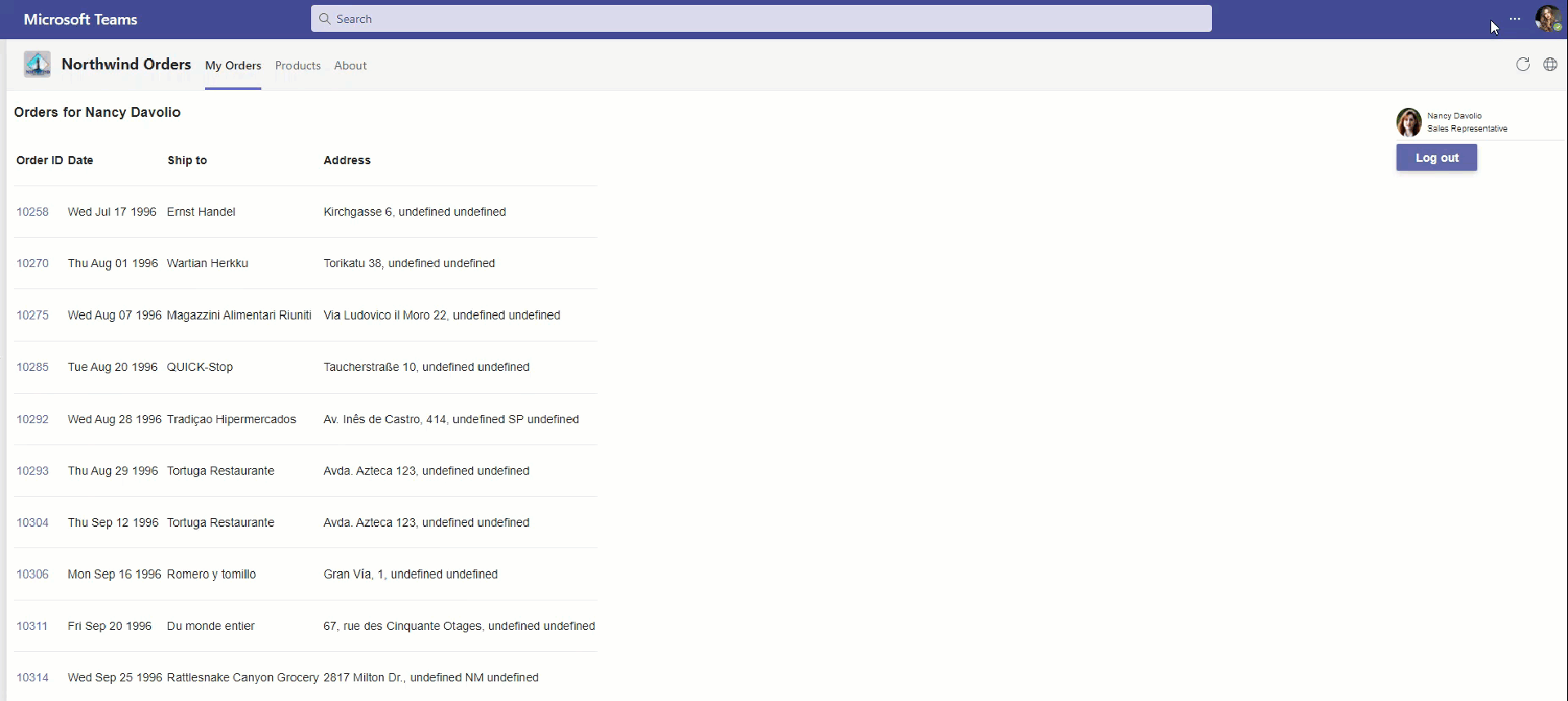
Once the teams tab app is added, the personal tab will open My Orders tab. The application will now have the team’s native look and feel.
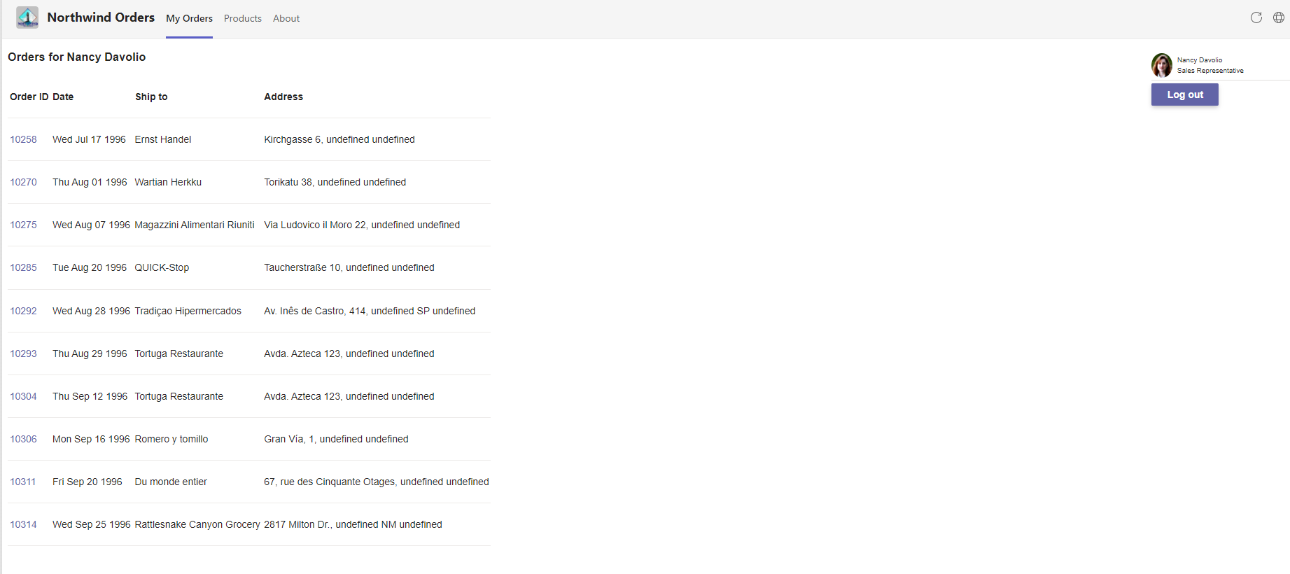 Change themes in teams client.
Notice how the teams tab app also detects and changes it’s theme.